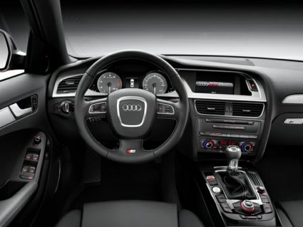
new steering wheel design...
 12-17-2010, 07:34 AM
#1
Audiworld Junior Member
Thread Starter

Join Date: Mar 2010
Posts: 96
Likes: 0
Received 0 Likes
on
0 Posts
notice the change back to the old "circle" at the center of the steering wheel for the upcoming audi a6... love this move...the trapezoidal shape while reflecting the signature grill always looked odd to me... wonder if they will change in next refresh...

 12-17-2010, 08:49 AM
#4
That's the point, otherwise you'd have a huge fat spoke on the bottom and you wouldn't be able to see much on the inst panel. I like it, but think that S models should get the thicker, flat-bottom wheel as on the RS6.
12-17-2010, 09:52 AM
#5
AudiWorld Member

Join Date: Dec 2009
Location: NOVA
Posts: 55
Likes: 0
Received 0 Likes
on
0 Posts
I get the point. I just think think the lack of symmetry between the round horn and the spokes has a somewhat awkward look. I think the S models should have gotten the thicker, flat-bottom wheel also.
12-17-2010, 10:18 AM
#6
AudiWorld Member
Join Date: Dec 2010
Location: Philadelphia
Posts: 246
Likes: 0
Received 0 Likes
on
0 Posts
12-17-2010, 10:26 AM
#7

Last edited by GR8-LIFE; 12-17-2010 at 10:31 AM.
Trending Topics
12-17-2010, 01:03 PM
#8
Audiworld Junior Member
Join Date: Jan 2010
Posts: 54
Likes: 0
Received 0 Likes
on
0 Posts
i feel ya, i think a circle in a circle is a bit too much. one thing we can all agree is that we need a thicker wheel tho.
12-17-2010, 01:16 PM
#9
Personally I would want it to be a bit thicker and a liitle smaller. Oh, and one that readily attaches and detaches would be great too. It could be a Detachable steering wheel option
 12-17-2010, 01:55 PM
#10
AudiWorld Member

Join Date: Jul 2002
Posts: 306
Likes: 0
Received 0 Likes
on
0 Posts
That A6 interior looks like a$$ to me. First off the trim on the door is way too short. should go all the way back otherwise it looks to plain in that picture. Second the center stack with the pop up looks like garbage and I wonder if the glare from the sun will affect the display without it being inset into the dash. The A4 design looks much nicer but needs just a bit of upgrade in materials.
Last edited by riegerman; 12-17-2010 at 01:58 PM.